www.dataworldwide.org

Home

Search for Data

Data Sources by Topic

All Indexes & Rankings

Find Index

Global Demography

Urbanization

Population Aging

Public Health

Education

Economy

Poverty

Policy, Society, Culture 

Global Financial System

Environment

Conflict, War, Strategy

Country Profiles

City Data & Statistics

Data on Africa

Data Sources: Institutions

All Statistical Offices  

All Central Banks

Selected "Think Tanks"

"Deep Web" Sites

Other Institutions with Data

Economic Research Centers

Intelligence / Surveillance

Data Visualization

Tools

Examples

News

WorldNewsLinks.org

Other

About

Support

Mobile Version

Privacy Policy

Data Visualization: Examples

Updated: 31 January 2015

Terrorism in Syria

Foreign fighter flow to Syria

Sources: International Center for the Study of Radicalisation and Political Violence (ISCR), The Soufan Group, CIA. Gene Thorp, Julie Tate and Swati Sharma. Published on October 11, 2014. Graph taken from the Washington Post.

An estimated 15,000 militants from at least 80 nations are believed to have entered Syria to help overthrow the regime of President Bashar al-Assad according the CIA and studies by ISCR and The Soufan Group. The slight highlights the flow of fighters to Syria.

The Soufan Group

International Center for the Study of Radicalisation and Political Violence (ISCR)


Movies

The Ebb and Flow of Movies: Box Office Receipts 1986 — 2008

Sources: Baseline StudioSystems; Box Office Mojo. Mathew Bloch, Lee Byron, Shan Carter and Amanda Cox, New York Times, Infographic, 23 February 2008

Here's a look at how movies have fared at the box office, after adjusting for inflation.


London - Daily Commutes

Daily Commutes into London

Paul Kerley, BBC News Magazine

Depiction of dily commutes into London with data from the 2011 Census.

Image is subject to copyright - London: The Information Capital by James Cheshire and Oliver Uberti (Particular Books).


Better Life

The better life snowflake

Visualization of data from the Organization for Economic Co-operation and Development by Paula Filippone.


Hurricane Sandy

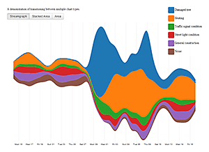
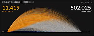
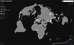
Hurricane Sandy's Impact on NYC 311 Calls

Some of the most frequent 311 complaint types are shown for the days before and after Sandy hit New York City, indicating the dramatic shift in how this service was used during the disaster.
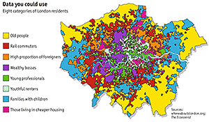
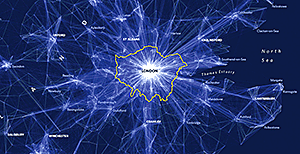
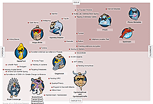
 

Data visualization: Debt crisis

An Overview of the Euro Crisis

The New York Times, Sunday Review, published 22 October 2011.
Arrows show imbalances of debt exposure between borrowers in one country and banks in another; arrows point from debtor to their bank creditors. Arrow widths are proportional to the balance of money owned.

Comment: This visualization is a nice example of how graphs can be used to convey ideologically motivated messages. The description of the graph highlights the fact that "France's banking system (is) more exposed to Italian debtors". However it fails to point out that the United States is, by far, more exposed to debtors than any other country. The multiple thick arrows pointing out from the United States are colored in a light gray - suggesting irrelevance, while the few thin arrows, indicating the exposure of European countries, are colored in signal red.


Whereabouts London

An experiment in how open data can be used to understand and improve future cities

Whereabouts London is an ongoing experiment by the Future Cities Catapult to explore how open data can be used to help cities and citizens see their environment in a new light.


Percentage of Muslim population by country

Map by M. T. Hunter, 29 June 2014;
Data from Pew Research Center, 2014 (pdf)


The world's top 50 banks -
and the institutions that no longer exitst.

Guardian Infographic with data from The Banker magazine, 25 March 2009


Foreign Fighters in Iraq and Syria:
Where Do They Come From?

Radio Free Europe, Radio Liberty, 29 September 2014

Powered by Tableau


Patterns of Storms

Storm warning: prepare for a busy hurricane season. New Scientist, 31 May 2011

Powered by Tableau, Data by NOAA


Advertisement: Smart books from Amazon.com

James Cheshire / Oliver Uberti (2014) London: The Information Capital. 100 maps and graphics that will change how you view the city. Particular Books

Alexandru C. Telea (2014)
Data Visualization. Principles and practice. 2nd edition. A.K. Peters / CRC Press

David McCandless (2014)
Knowledge is Beautiful. Impossible ideas, invisible patterns, hidden connections - visualized. Harper Design

Ian H. Witten / Eibe Frank (2011)
Data Mining. Practical machine learning tools and techniques. 3rd Edition. Morgan Kaufman

In Association with Amazon.com


Tale of 100 Entrepreneurs

How Long Does It Take To Build A Technology Empire?
Wall Street Journal, 25 August 2009

Powered by Tableau


Wealth Year 2015

SASI Group, University of Sheffield; Mark Newman,
University of Michigan, 2006


U.S. Secret Terrorist-Tracking System

Database of Terrorist Suspects (THE // INTERCEPT, 5 August 2014)


U.S. Gun Deaths in 2013 and 2010

People killed and "stolen years" (periscopic.com)


Top Secret America

Washington Post


Worldwide Remittance Flows 2010

Tages Woche


Wind Map

Fernanda Viégas and Martin Wattenberg
(use Chrome Browser)


Real-time Wind Map of the Globe

Cameron Beccario, NCEP / National Weather Service / NOAA (use Chrome Browser)


Three-Generation-Model of Wealth Transfer

G.K. Heilig, demographics.at


Flight paths worldwide 2012

Alexey Papulovskiy, contrailz.com


How the recession reshaped the U.S. economy

New York Times


The Evolution of an Organization

Autodesk Research


How much is time wrong around the world?

Stefano Maggiolo


Advertisement

Nathan Yau (2011): Visualize This: The FlowingData Guide to Design, Visualization, and Statistics. Wiley,
1st Edition.

Scott Murray (2013): Interactive Data Visualization for the Web. O'Reilly Media; 1 Edition.


David McCandless (2012): Visual Miscellaneum: The Bestselling Classic, Revised and Updated: A Colorful Guide to the World's Most Consequential Trivia. Harper Design; Revised edition.

Gareth Cook (Ed.) (2013): The Best American Infographics 2013. Mariner Books.

In Association with Amazon.com


The Corruption Perception Index 2012

Transparency International


Billionaires worldwide

Kim Albrecht


Meteoroids 1900-2000

Kim Albrecht


Geographic distribution of predicted H7N9 infection risk (bird flu)

Marius Gilbert, et. al.


Dark Intelligence

Cyber attacks from darknets in hundreds of locations from over 40 countries. Attack flows against the NORSE honey pot infrastructure.

NORSE


Historical Energy Mix in Germany

Gregor Aisch, driven-by-data.net


Advertisement

ona M. Wong (2013) The Wall Street Journal Guide to Information Graphics: The Dos and Don'ts of Presenting Data, Facts, and Figures. W. W. Norton & Company; 1 Edition.

Randy Krum (2013) Cool Infographics: effective Communication with Data Visualization and Design. Wiley, 1st Edition

Stephen Few (2006) Information Dashboard Design: The Effective Visual Communication of Data. O'Reilly Media

Mark Stacey (2013) Visual Intelligence: Microsoft Tools and Techniques for Visualizing Data. Wiley, 1st Ed.

In Association with Amazon.com


Consequences of rapid population growth

G.K. Heilig, demographics.at


The NSA Revelations All in One Chart

Pro Publica


How Americans Die

Bloomberg


American Highway System

Transit Maps


The Elements According to Relative Abundance

Wm. F. Sheehan, University of Santa Clara


Dominant Players over Time

Randall Munroe, xkcd


Internet & Population

Gregor Aisch, driven-by-data.net


Party Donations in Germany

Gregor Aisch, driven-by-data.net


No IP tracking


Copyright © 2014, 2015 by Gerhard K. Heilig. All rights reserved.

Updated: 20 May 2015